
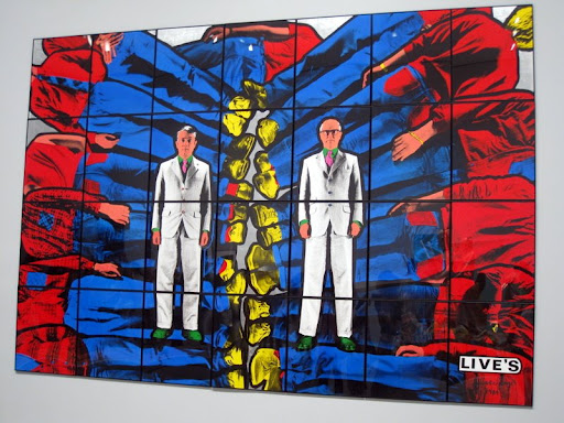
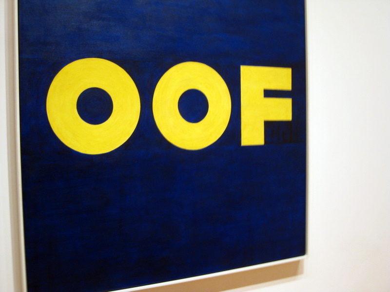
This is probaby one of my favourite pics from the museum. There is something about the use of primary colours as well as black and white that makes for a striking image. I kinda wish now that I had taken the time to read more about what the display was about…
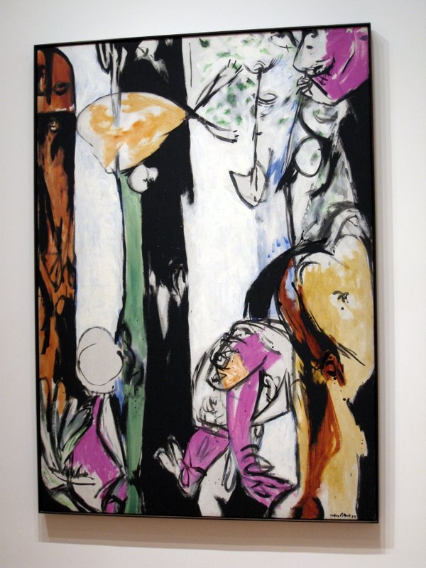
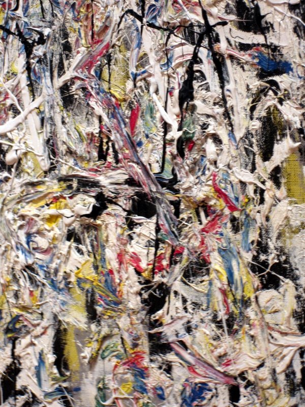
Then I discovered some amazing oil paintings by American artists, Arshile Gorky and Jackson Pollock. This one is by Pollock titled “Easter and the Totem.” Love the delicious purply pink in this painting, makes me wanna wear it as a dress, or patent heels. Mmmmm…
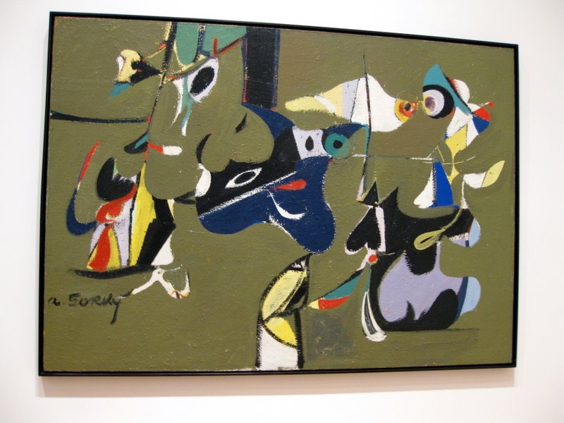
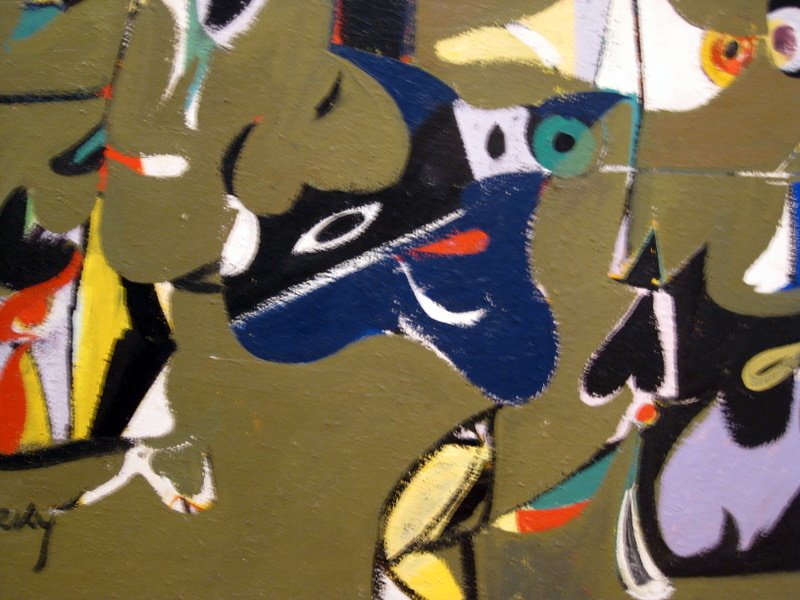
This one is by Gorky, titled “Garden in Sochi.” I always smile when I look at this 🙂 I want it!
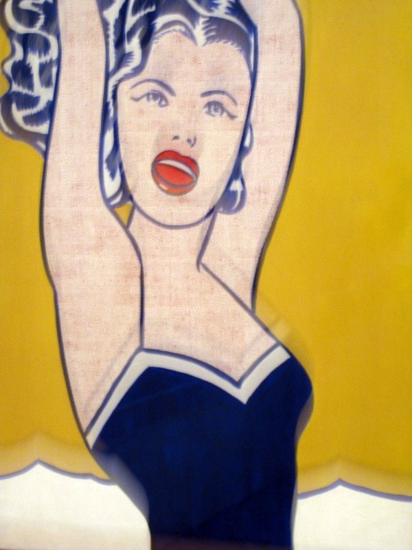
Came across some pop-art style exhibits that look to be comic-inspired. Which reminds me…gutted I missed out on the ‘Super Heroes’ exhibition at Metropolitan Museum! My tutor recommended that I go see it but I didn’t get the chance to visit the museum due to lack of time. Poo.
The following are 3 separate photos put side by side taken by my friend Marie. What I like about these are the colours and composition – clean and simple. I can see the sky blue in chambray and light faded denim, and the dirty orange and pink in summer dresses and tops.
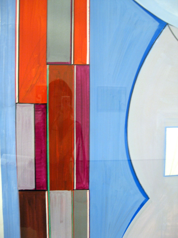

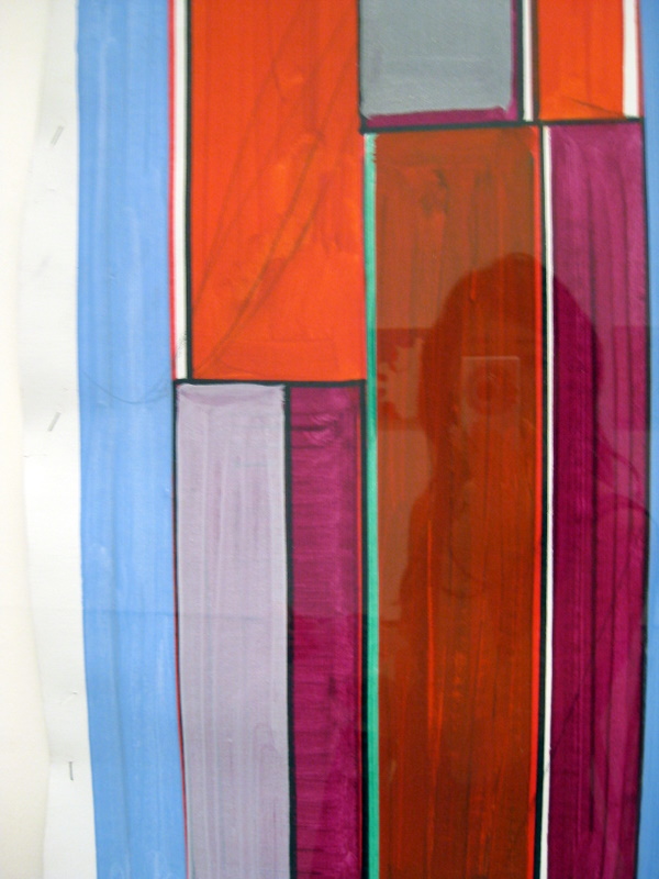
Again, I love the colours of the next 2 photos. They make excellent colour palettes, and I can also imagine the prints on tees and dresses.
